
Fundraising tips that turn first gifts into repeat donors
Use 7 fundraising tips to cut page friction, sharpen the ask, and lift repeat donations in 2026 with faster follow-up and clearer impact.


A clean donation page on a laptop beside a phone showing a fundraising campaign with supporter updates and recurring...
Quick answer
Start with the ask itself: make it specific, remove anything that slows the gift, and tighten follow-up before you add more promotion. That sequence usually beats “more content” because donors respond to clarity, not volume. If your page already has trust but weak repeat giving, the problem is often the handoff after the first gift. If you want a faster improvement, rewrite the primary ask first and then check whether the thank-you loop is immediate and human.
What this guide helps you improve
This is not a list of fundraising ideas or a promotion checklist. It is a practical guide for the part that actually changes donation response: the ask, the page, the email, the event moment, and the follow-up that comes after the gift.
The same rule keeps showing up across strong fundraising copy: donors give faster when they understand what the money does, who it helps, and what happens next. GoFundMe’s fundraising tips point in that direction with descriptive titles and specific asks, and the more general pattern shows up again in competitor material that stresses clarity, visuals, and follow-up as the basics that keep a campaign moving.
If you want the shortest path to more donations, do not start by adding more channels. Start by checking whether the current channel already answers one question cleanly: why give now, and what changes if I do?
The tips that move response fastest
Rank changes by how much uncertainty they remove. The strongest fundraising tip is usually the least flashy one because it cuts the most hesitation.
1) Make the primary ask specific
Vague asks make donors do the thinking for you. “Support our mission” sounds polite, but it does not tell the reader what the gift covers or why this amount matters now.
A specific ask gives the donor a shape to hold. That can mean an outcome, a dollar amount, or a unit of help: one supply box, one ride, one week of meals, one month of program support. GoFundMe recommends clear and memorable titles, details on what the funds support, and specific amounts tied to outcomes, which is the right direction for this step.
2) Put the promise at the top of the page
A donor should not have to scroll to understand the point of the page. The top section needs the cause, the use of funds, and the next step in plain language.
That is not a design trick. It is a friction rule. If the first screen makes people decode the campaign, you lose some of the response you already earned.
3) Use one credible visual that matches the story
Personal photos and short video work because they make the ask feel real, not generic. Competitor material notes that campaigns with personal photos can raise up to 40 percent more, but the more important lesson is simpler: people connect faster to a real person, place, or project than to a blank template.
Use the image to prove you are talking about an actual situation. A generic stock photo can do the opposite and make the campaign feel borrowed.
4) Tighten follow-up while the gift is still fresh
Follow-up is not a courtesy add-on. It is part of the conversion path.
The supplied Scrile material cites a Classy.org claim that 75% of donors are more likely to give again if they receive a thank-you within 48 hours. Treat that as a useful timing signal, not a universal guarantee. The lesson is still clear: if the thank-you is slow, the next gift gets harder.

What usually hurts donation response
Most campaigns do not lose donors because the cause is weak. They lose donors because the page makes the reader guess, wait, or choose too much at once.
Vague goals
If the donor cannot tell what the money supports, the ask feels risky. Risk slows response even when the cause is strong.
That is why “help us do more” underperforms against a direct use-of-funds statement. Clarity is not decoration; it is decision support.
Generic copy
Generic language sounds safe, but it rarely moves people. It can still fill space without creating a reason to act now.
What works better is one concrete situation, one outcome, and one request. The reader should leave with a picture, not a slogan.
Weak proof
A page without visible proof asks the donor to trust too early. If there is no photo, no update, or no plain statement of where the money goes, hesitation rises.
Proof does not have to be dramatic. It just has to be specific enough that the donor can tell the campaign is real and active.
Slow or absent follow-up
A late thank-you makes the donor feel like the system noticed the money, not the person. That is a quiet way to damage repeat response.
The first gift opens the relationship. The follow-up decides whether that relationship has any momentum.
| Which tip affects which part of the donor journey? | Primary failure mode it fixes | Best use |
|---|---|---|
| Specific ask | Donor has to guess what the gift covers | Donation page headline, email subject, event ask, first-line appeal |
| Clear top-of-page promise | Interest is lost during the first scan | Donation page hero section and mobile view |
| Personal visual | Campaign feels generic or borrowed | Donation page header, email preview image, event slide |
| Fast follow-up | First gift does not lead to repeat engagement | Receipt, thank-you note, first update, recurring ask |
That table is the simplest way to check whether a campaign has a trust problem, a clarity problem, or a follow-through problem. If you only fix one thing, fix the row with the biggest failure mode.
How the same tip works on page, email, event, and follow-up
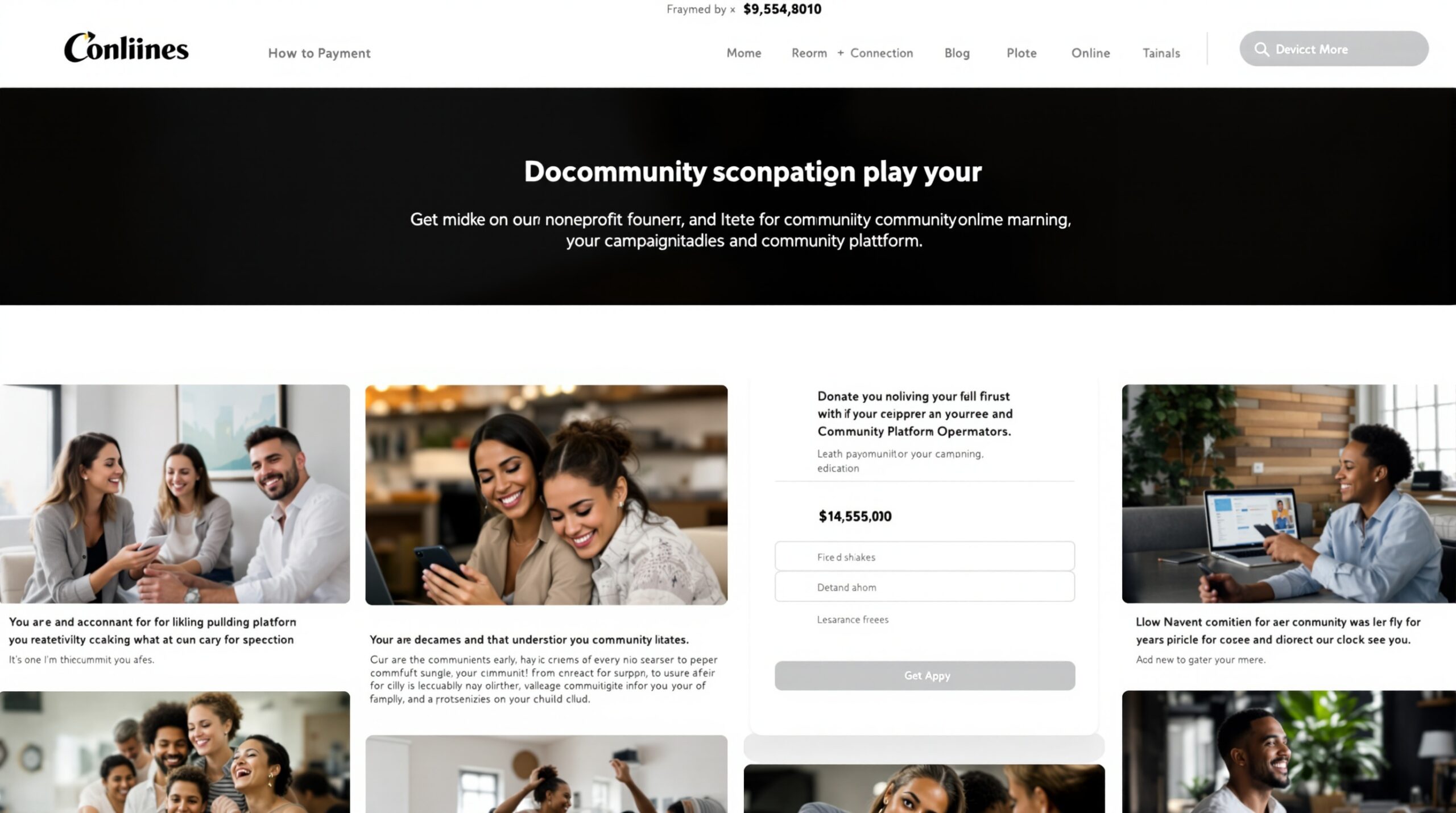
The core principle stays the same across channels, but the format changes. Donation pages need clarity and low friction. Email asks need one action. Event asks need a live, concrete route to give. Follow-up needs speed and proof that the donor was noticed.
Donation page
The page should answer three questions fast: what is this, why now, and what should I do?
When those answers are buried, the button becomes another decision. When they are clear, the button feels like the obvious next step.
Email ask
Email has less room, so specificity matters even more. One short reason, one clear amount or outcome, and one action are usually enough.
Do not use the email to retell the whole campaign history. Use it to move a reader from interest to click.
Event ask
An event ask works when the audience can hear the goal in real time. Name the amount, what it covers, and how to give right now.
Abstract applause does not convert. A live number plus a visible route to donation usually does.
Post-donation follow-up
After the gift, the job changes. Now the campaign has to prove it remembers the donor.
A short thank-you, a quick impact note, and a clean path to recurring support do more here than another general appeal. If you need a deeper visual example of how the page can be structured, use the sister article on donation page examples as a side-by-side reference before you edit.

Common mistakes and when generic tips stop working
Generic tips stop working when the real issue is not inspiration. It is sequence.
One common mistake is adding more words when the donor needs fewer decisions. Another is promoting the campaign before the page itself is understandable. A third is treating every campaign like it needs the same mix of urgency, proof, and follow-up.
There is also a boundary condition worth naming directly: if the audience already trusts you but the response is weak, more storytelling will not fix the gap. In that case, the better move is usually to tighten the ask and the follow-up loop, not to keep widening the promotion net.
That is where a branded setup such as Scrile Connect – Fundraising Platform can matter, because the hard part becomes keeping the campaign, the receipt, the update, and the donor record connected after the first click. The tool is useful when the issue is not attention alone but operational follow-through.
What to track after you change your fundraising page
Do not measure everything. Measure the step you changed.
Donation completion
If you rewrote the ask or simplified the top of the page, watch whether more visitors finish the donation flow. That is the cleanest sign that the page is easier to use.
Repeat response
If you changed thank-you timing or added a follow-up sequence, check whether donors come back or click the next message. Repeat response is the real test of whether the first gift turned into a relationship.
Update engagement
If you started posting campaign updates, check whether donors open them, click them, or reply. An update that nobody sees does not help retention.
Keep the measurement simple: one page change, one channel, one follow-up rule. That is enough to tell whether the change moved response or just made the page feel busier.
What to change first if you want more donations now
Use this order when response is flat and you need a practical starting point:
- Rewrite the top ask. make it specific, concrete, and easy to picture. If the donor has to infer the value, rewrite again.
- Remove extra actions from the first screen. the page should have one primary action. Shares, volunteer asks, and extra links can wait.
- Add or replace one visual with proof. use a real image that matches the story. If the current visual feels generic, it is costing trust.
- Set the thank-you sequence before the next campaign push. immediate acknowledgment and a short update are more useful than another broad appeal.
- Check one metric for the change you made. if the edit was about the ask, look at completion. If the edit was about follow-up, look at repeat response.
If you want to compare your rewrite against stronger structures, the next useful stop is donation page examples. Seeing the layout side by side usually makes the weak points obvious faster than another brainstorming round.
For teams that want these fundraising tips to live inside one branded system, Scrile Connect – Fundraising Platform fits the workflow after the copy is fixed. It can support fundraising sites, donation platforms, campaign communities, recurring support, paid updates, and supporter engagement under one branded setup.
That matters when the problem is not just one page, but the full donor path around it: campaign page, thank-you, updates, and the next ask. A unified setup helps keep those steps from drifting apart.
It is most useful when ownership, follow-up, and repeat support matter more than a one-off campaign page. If your team needs a durable fundraising operation, the platform should support the page and the relationship without forcing a rebuild later.
Ready to build the setup behind this?
If this is the operating problem you need to solve, use the product page as the next step. It shows where build your setup fits and what the platform covers beyond a single payment widget.
Frequently asked questions
Which fundraising tip should I fix first if I want more donations quickly?
Start with the ask itself. Make it specific, reduce uncertainty, and remove unnecessary friction before adding more promotion or more content.
What usually hurts donation response most?
Vague goals, generic copy, weak proof, and slow or absent follow-up. Those are the most common places where response leaks out of the donor journey.
How do fundraising tips change between donation pages and email asks?
The core principle stays the same, but the format changes. Donation pages need clarity and low friction; email asks need one clear action and one specific request.
When do common fundraising tips stop working well?
They weaken when the audience is small, the campaign is offline-heavy, or the ask already has enough trust but lacks operational follow-through. In those cases, more promotion is not the first fix.
What should I track after changing my fundraising page?
Track donation completion, response rate, and repeat engagement rather than only traffic. That tells you whether the change improved the part of the journey that matters.
