15 Church Website Ideas to Inspire Your Design
Get inspired with practical church website ideas drawn from real ministries, modern design trends, and UX patterns that actually work. This article walks through core features, 15 concrete layout concepts, and how Scrile Connect can build a custom church site tailored to your community, not a generic template.
church website ideas
Many communities search online before stepping into a sanctuary, and surveys from U.S. faith-research groups show that more than 70% of newcomers review a church’s site before deciding to visit. This is why exploring church website ideas has turned into a practical step for any parish that wants to stay visible and welcoming. A clear homepage, a working schedule, and a simple way to ask questions help visitors feel prepared long before Sunday arrives. Digital tools also support ministries during the week: members check event updates, volunteers get reminders, and families rewatch sermons they missed. A website becomes part of the rhythm of community life, carrying the message beyond the building’s walls.

What Visitors Expect From a Church Online in 2026
A church website works as the first touchpoint for most newcomers, and visitors arrive with clear expectations. They want fast access to essential information, a layout that feels simple to navigate, and features that make the community easy to understand before attending in person.
People usually look for:
- A service schedule that’s impossible to miss, including times, locations, parking notes, and any details for families with children. When this information sits at the top of the homepage, visitors stay longer and ask fewer basic questions later.
- Mobile-first navigation that behaves smoothly on small screens. More than half of faith-related searches start on phones, and people expect readable text, menus that open without delay, and tap-friendly buttons that even older visitors find comfortable.
- A donation experience that feels transparent and quick. Many churches now receive a large share of weekly giving online, so visitors look for recurring donation options, a secure checkout flow, and short explanations of how each fund supports the community.
- Clear community pages showing real activity. Newcomers want an idea of weekly life, so they explore small groups, youth programs, volunteer roles, and any events the church highlights through photos or short clips.
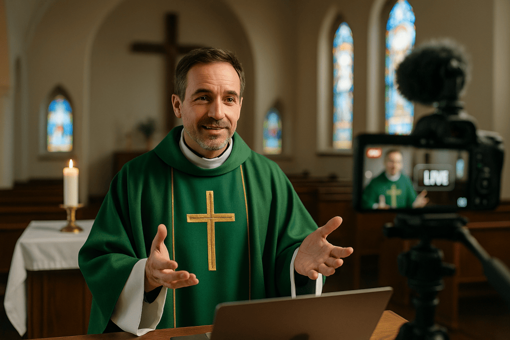
- Easily accessible sermon media, since people often watch or listen before showing up in person. A site with cleanly organized sermon archives, live-stream links, and short video previews encourages longer browsing sessions.
Elements That Keep People Exploring
Small interactive features often decide whether a visitor stays for a minute or keeps browsing. A simple prayer-request form gives people a private space to reach out, which builds trust and makes the site feel responsive. Event reminders sent to email or mobile notifications help members keep up with midweek activities without digging through multiple pages.
Volunteer sign-up tools make it easy to join a team right away, and that sense of immediacy encourages participation. Many churches also include a short “New Here?” guide that answers the questions newcomers worry about most, from where to check in children to how long a service usually lasts. These elements give the site warmth and momentum.
Foundations Before Design: Core Features Every Parish Site Should Offer
A solid structure makes a parish website dependable and easy to use. These core features form the base before any design or creative elements come in:
- A clear daily or weekly schedule that shows service times, midweek gatherings, ministry meetings, and seasonal events. This helps families plan, reduces uncertainty, and gives the site a steady rhythm.
- A well-organized sermon library with categories, simple filters, and short descriptions, so visitors can explore past messages without searching through long lists. Many people listen to a sermon or two before attending in person, so clarity matters here.
- A reliable donation system that supports one-time gifts, recurring contributions, and special campaigns. Churches benefit when the giving flow is simple, transparent, and secure.
- Dedicated pages for community groups that describe each group’s focus, meeting style, and joining process. These pages help newcomers understand where they might fit, which is why great church websites highlight groups prominently.
- Contact and direction details that appear in a predictable place. A map, a short parking outline, and a direct communication channel make the first visit easier and reduce last-minute questions.
Together, these fundamentals create a stable, informative structure that supports every design choice that comes next.
15 Design Ideas That Shape a Memorable Church Website
Design choices decide how people feel when they land on a site. Good church website ideas blend clarity, warmth, and storytelling without overwhelming visitors. These concepts focus on layout, visual style, and interaction patterns that make church websites memorable and easy to explore.
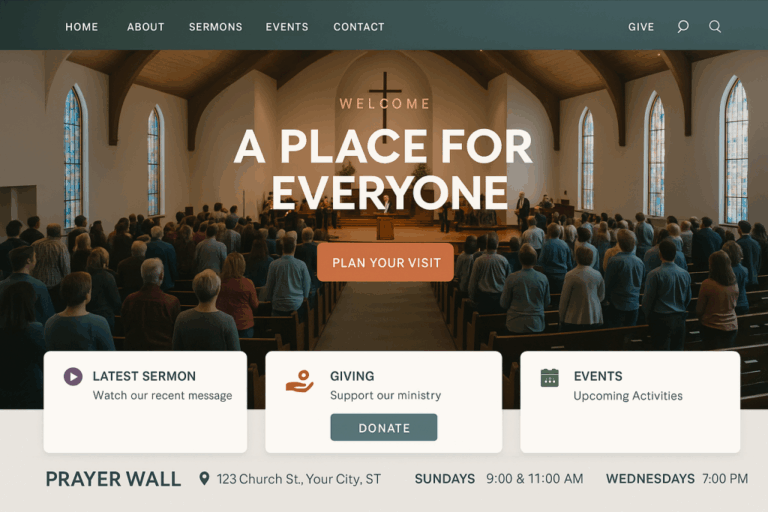
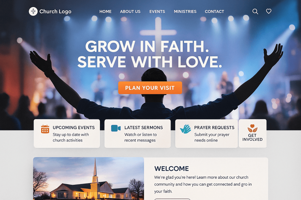
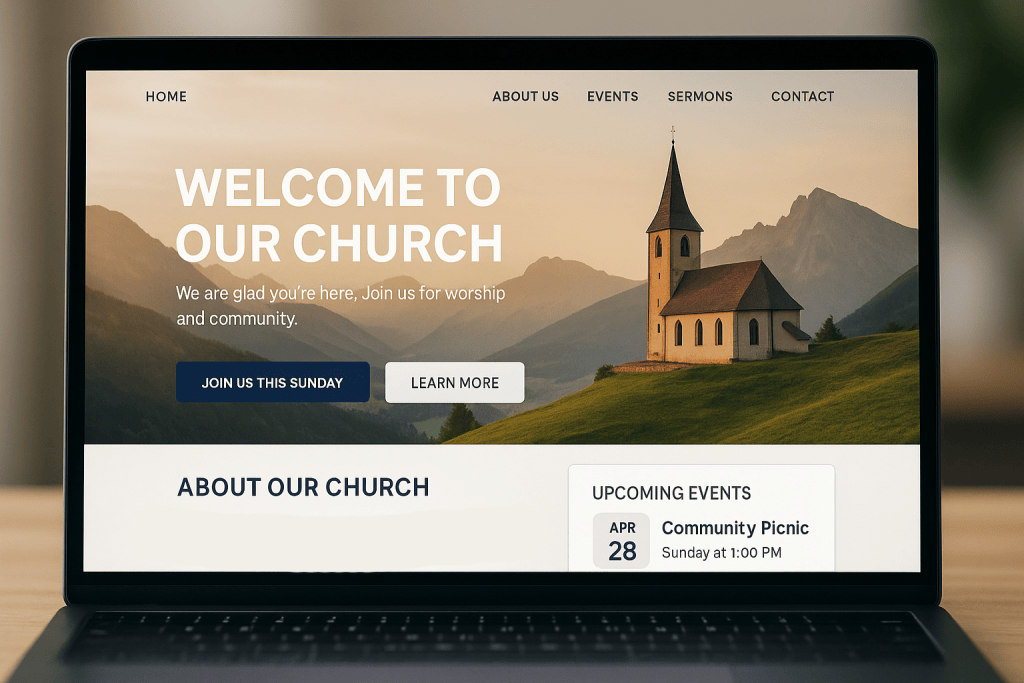
A Hero Image That Sets the Tone
A homepage with a full-width photo of the congregation, the sanctuary, or a recognizable moment gives visitors an immediate sense of place. Emotional recognition works faster than text, and a single strong visual introduces the community before a user even scrolls.
Clean Navigation Paired With a “Plan Your Visit” Flow
Instead of a basic button, churches can use a guided micro-journey: a short sequence asking whether the visitor is local, bringing kids, or exploring for the first time. The layout feels modern and helps newcomers prepare in less than a minute.
A Dynamic Sermon Hub With Visual Cards
This idea focuses on design, not content. Sermons can be shown as thumbnail cards with consistent cover art, hover states, and category colors. A clean grid makes the archive easier to skim and gives the media library a strong identity.
A Video Background That Adds Atmosphere
Some parishes use a quiet clip—sunlight through stained glass, choir rehearsal, or people gathering before service. When muted and slow, the video softens the layout and gives the homepage movement without distraction.
A Donation Page Built Like a Landing Page
Rather than a plain form, a donation page can use persuasive design: short stories, photos from community projects, and simple graphic blocks. Clear hierarchy keeps the page readable, while visual cues highlight recurring giving.
Social-Ready Event Banners
Event graphics designed in one consistent style help churches share announcements across their site, email, and social media. A unified banner format makes the brand feel intentional and helps visitors recognize upcoming activities instantly.
An Online Prayer Wall With Thoughtful Visuals
A prayer wall can be presented with gentle colors, rounded shapes, and subtle animations. Each request appears as a small card, creating a mosaic effect. Guests can read, pray, and submit their own messages through a calm, uncluttered layout.
Modern Typography That Matches the Church’s Voice
Fonts express personality. Soft serif typefaces suit historic parishes, while clean sans-serif fonts fit contemporary communities. Mixing type weights—bold headers, light body text—creates visual contrast and guides the eye without overwhelming the reader.
A Youth & Kids Hub With Its Own Visual Style
Families look for clarity, and a dedicated hub with a playful color palette, simple icons, and short descriptions helps them understand what happens each week. This layout can include a rotating gallery, team introductions, and quick links for registration forms. It becomes one of the most practical church website ideas for communities with growing families.
A Volunteer Center Designed Like a Recruitment Page
A polished volunteer section uses strong headlines, portraits of team leaders, and clear steps to get involved. Bringing recruiting design patterns from nonprofits creates momentum and lets people imagine themselves serving. This format turns a simple sign-up page into a space that motivates action.
Multilingual Support With a Smooth Toggle
For diverse congregations, language toggles deserve careful placement and clean styling. A small icon in the top corner, paired with a simple dropdown, keeps the interface elegant. Consistent layout across languages avoids confusion and reinforces accessibility.
Location and Service Time Modules That Feel Interactive
Rather than posting plain text, churches can display service times inside small cards with icons, color accents, and short notes for each location. An embedded map with smooth zoom adds movement and makes the visitor journey more intuitive.
A Staff Directory With Personality
Portraits, short bios, and a consistent photo style make leadership feel approachable. When arranged in a clean grid, each profile becomes a friendly touchpoint. This is one of the church website ideas that creates instant familiarity for newcomers.
A Newcomer Onboarding Page Built as a Simple Journey
Instead of a long text block, the page can guide visitors through steps: what to expect, how long services last, where to go first, and who to meet. Each step gets its own panel with a photo or short video. This journey-style layout feels personal without overwhelming anyone.
A Mobile-First Layout With Scroll-Based Sections
More people browse on phones than desktops, so a layout built around vertical movement works well. Structured blocks—hero, welcome message, ministries, sermons, events—help users explore naturally. This approach keeps pages light, readable, and fast. It also remains one of the most practical church website ideas when designing for broad age groups.
Real Examples: What the Best Ministries Are Doing Right
Strong digital design becomes much clearer when you look at ministries that already shaped polished experiences. Many churches listed among the best church websites rely on visual focus, fast performance, and clear storytelling rather than heavy effects. Elevation Church, with more than 20,000 weekly visitors, uses a clean layout where a single headline and one strong visual guide the entire homepage. Their structure shows how simplicity can feel powerful when executed well.
Red Rocks Church takes a community-driven approach. Their homepage highlights real people and real moments: worship nights, small gatherings, and service projects. These photos build trust instantly, especially for visitors who want to understand the culture before attending.
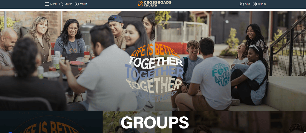
Crossroads Church uses modular design with evenly spaced blocks, short descriptions, and warm color accents. This style works well for mid-sized congregations, because it keeps information tightly organized without feeling plain. Churches with smaller communities can borrow this pattern to create clarity without overdesigning.
Life.Church leans heavily on video, but in a focused way: short clips introduce ongoing series, upcoming events, or missions, and each video thumbnail has consistent artwork. This makes their media library easy to browse and turns the site into a familiar weekly touchpoint.
Even modest parishes benefit from these patterns. Well-lit photography, recognizable colors, and simple grids often achieve more than complex effects. Regular churches can pull inspiration from these examples by choosing two or three design principles—clean spacing, consistent visuals, or short text blocks—and applying them across the entire site for a polished, trustworthy presence.
Quick Snapshot of Features and Goals
When planning or refreshing a site, it helps to map each design choice to a clear purpose. This overview ties common elements to real visitor needs and supports smoother decision-making when exploring church website ideas. The goal is not to copy large ministries but to understand why certain layouts work and how they guide people toward the next step.
| Feature | What It Solves | Why Churches Value It |
| Visual sermon cards | Helps visitors skim messages quickly | Makes archives approachable |
| Highlighted community photos | Shows real participation | Builds immediate credibility |
| Donation landing block | Explains giving clearly | Supports financial stability |
| Youth & kids mini-hub | Answers family questions fast | Improves newcomer comfort |
| Mobile-optimized sections | Removes phone navigation issues | Serves the majority of users |
A Parish Website Under Your Rules with Scrile Connect
Building a modern presence requires more than a template. Many churches want a site built around their mission, tone, and community rhythm, and that’s where a custom approach matters. Scrile Connect works as a development service rather than a SaaS platform, giving churches room to shape every part of their church website design without being limited by preset layouts.
Scrile Connect builds projects as individual solutions. The team structures each site from the ground up, adjusting the flow, the pages, and the interactions around the way a parish functions. This gives ministries freedom to present their message clearly and avoid generic layouts that never feel like a true fit.
Key advantages include:
- Fully custom design based on a church’s identity, photography, and preferred visual style.
- Tailored user flows that match ministries, events, and communication habits.
- Built-in payment options for donations, programs, or event registrations.
- Community features such as private groups, messaging, and member dashboards.
- A protected media library for sermons, internal updates, or training material.
Because Scrile Connect develops each site independently, every choice—from navigation to mobile behavior—reflects local needs. A church with multiple campuses might need a location switcher. A smaller parish may want a simple homepage built around one weekly service. The structure adapts to the community instead of forcing the community to adapt to the structure.
For churches ready to refresh or build from scratch, Scrile Connect offers a path where design, features, and long-term scalability stay fully under their control.
Conclusion
When done well, a site integrates seamlessly into the church’s activities, leading visitors, assisting believers, and representing a church clearly. The examples and ideas above provide a multitude of church website ideas that a church can implement to improve storytelling, simplify navigation, or give their church a friendly identity. Even the smallest touches of design, such as color, space, or media, make a world of difference for users of a church’s website.
Churches that plan to renovate or start from scratch can achieve much more if offered a solution tailored to their needs. Scrile Connect builds customized websites for church ministries, giving each church its own space to design and plan for its own future. To explore what your church can build, visit Scrile Connect page and start shaping your project.
Related guides
