Donation Page Examples to Inspire Your Website
Discover what makes a donation page truly effective. Explore real-world donation page examples, learn the must-have design elements, avoid common mistakes, and see how you can build your own branded fundraising portal with Scrile Connect.
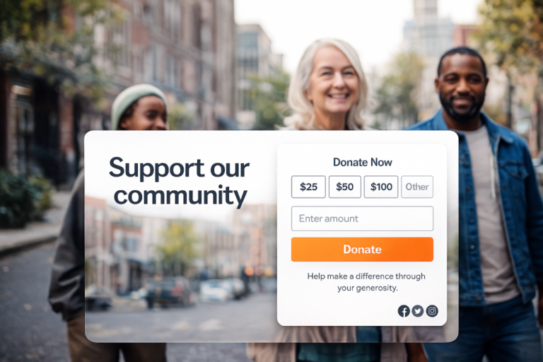
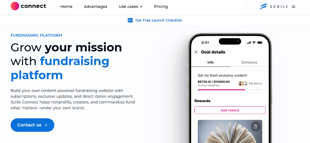
donation page examples
Plenty of good causes never hit their goals — not because people don’t care, but because the donation page doesn’t make them care fast enough. The design, the message, the structure — it all plays into whether someone clicks away or decides to give.
If you’re setting up a donation page, it helps to look at real donation page examples that achieved results. These pages guide visitors clearly, explain the purpose upfront, and make it easy to give. They use straightforward design, real voices, and simple tools to turn interest into action.
In this article, we’ll explore what strong donation pages actually do well, break down real examples worth learning from, call out common mistakes, and share how to create something custom with Scrile Connect — a solution designed for fundraisers who want full control, not just another template.

Why Donation Pages Make or Break a Campaign
A donation page becomes the moment where interest turns into support. People arrive curious, hesitant, or unsure, and the page must give them enough confidence to finish the gift. Digital fundraising grows every year, and most donors now give through a phone. This makes the quality of the page more important than the size of the audience.
Clear structure, simple language, and fast loading help visitors act without friction. Strong visuals guide attention. A logical flow keeps people from stopping mid‑way. Many donation page examples that perform well share these traits. The conversion rate for a well‑designed page often reaches 15 to 35 percent. Lower rates usually appear when the layout is confusing or the page feels unfinished.
Mobile design matters as much as desktop layout because more than half of donors complete the process on a handheld device. A fast page increases trust. Short forms reduce hesitation. Real names, photos, and transparent financial goals help people understand the purpose quickly. A website donation page works best when it respects the donor’s time and attention.
Numbers That Back It Up
Before looking at specific patterns, it helps to see how much these details change outcomes:
- Pages that include photos or video raise up to 80% more, based on Donorbox reporting.
- Long forms or slow pages cause nearly 60% of potential donors to stop before paying.
- GoFundMe data shows that campaigns reaching 30% of their goal within three days have a stronger chance of crossing the finish line.
These figures explain why small improvements matter. Anyone studying effective fundraising page examples will notice that the strongest pages simplify choices instead of overwhelming visitors.
What Great Donation Pages Have in Common
A donation page works best when it feels honest and easy to follow. People arrive with good intentions, but the page still needs to guide them. When you look at different donation landing page examples, you start to see patterns that feel simple on the surface, yet they make a real difference in how visitors respond.
Some organizations use long stories. Others rely on one clear sentence. Both can work. What matters is that the page gives people enough information to feel comfortable and enough direction to move forward without second‑guessing.
Transparency and Simplicity
Visitors want to understand what they are supporting. They look for short descriptions they can read in a few seconds. Many of the better pages explain:
- what the money will cover
- who receives the help
- how the goal amount was chosen
Nothing feels heavy. The layout stays open, almost quiet. The donate button is hard to miss, but it does not overwhelm the rest of the page. Most pages keep technical language out of the way and let the cause speak clearly.
Emotional Appeal and Visuals
People connect faster when they can see the story. A still photo of a person involved in the fundraiser often works better than a polished graphic. Some teams add a short video that shows the situation from the ground level. Others keep it minimal and focus on a single portrait.
What creates momentum is usually small details. A first name. A short update. A sign that the campaign is moving somewhere. These touches help visitors feel included rather than talked at.
Donation Flow
The path from the first click to the final confirmation should feel predictable. Pages that convert well usually select a few simple elements and arrange them neatly. Common choices include:
- preset amounts that reduce hesitation
- an option for monthly gifts
- a brief note from a past supporter
- a layout that works cleanly on a phone
- a progress indicator that shows how far the campaign has come
These pieces remove friction. They give the visitor a sense of progress before money leaves their account.
Elements of Top Donation Pages
A visitor clicks with a purpose. What they find next — layout, language, and tools — shapes whether they give or leave. Below are some real-world elements that show up again and again in donation pages that convert.
| Feature | Why It Matters | Example Tool or Site |
| Suggested Donation Tiers | Helps people choose fast, with less friction | Donorbox, GoFundMe |
| Video or Image Header | Sparks interest and builds emotional context | charity: water, Feeding America |
| Mobile Optimization | Most donors use their phones — the site must adapt | Scrile Connect |
| Branded Experience | Reinforces identity and builds long-term credibility | Scrile Connect |
| Transparent Use of Funds | Earns trust by showing exactly how money will help | GoFundMe, Donorbox |
Each of these touches can lift conversion, but the full effect comes when they work together — visually, technically, and emotionally. That’s what separates just another page from one that people remember and act on.
Donation Page Examples That Actually Convert
Good intentions alone won’t fill a donation goal. The layout, tone, and user experience all shape how people respond. Below are three donation page examples that stand out — not just for their mission, but for how effectively they turn visitors into contributors.
1. A Grassroots Campaign: Support for Megan’s Recovery (GoFundMe)
Megan’s family set up a GoFundMe campaign after an unexpected medical emergency. The page is simple but powerful. Right at the top, there’s a full-width photo of Megan with her daughter. The title is short and clear — “Help Megan Recover.” The description skips jargon and focuses on the timeline, treatment costs, and why they need help now.
The donation button stays sticky as users scroll. Suggested tiers start at $10, and each includes a quick message like “Covers a meal” or “Pays for a day of care.” The campaign also uses regular updates with photos from the hospital and personal messages from Megan’s husband. That transparency keeps the community engaged.
This is one of the best grassroots donation page examples because it’s raw, real, and easy to navigate.
2. Nonprofit Example: Charity Water
Charity: Water is often cited as a gold standard for clean, visual fundraising. Their donation page loads fast, with a hero video that opens with clean water being poured into a glass. It’s visceral and relatable. Visitors see exactly how much it costs to build a well and how many people it will serve.
The nonprofit donation page example also explains how 100% of donations go directly to the field — with private sponsors covering overhead. That single detail builds massive trust. Below the donation form, there are real-time stats, testimonials from donors, and a map of past projects.
Even on mobile, the whole experience feels polished and intentional. This isn’t just a donate page example — it’s a masterclass in credibility.
3. Local Impact: Save Sunnydale Animal Shelter
A small animal rescue in Oregon built its campaign using a simple WordPress template. The page title is “Help Keep Our Shelter Open,” and features rotating photos of dogs and cats up for adoption. The message is short: they’re trying to raise $8,500 before the end of the quarter to cover food, rent, and vet care.
What works here is the community angle. The team embedded a video message from their founder, along with donor shout-outs that appear dynamically. There’s also a calendar showing “sponsor days” — $150 keeps the shelter running for one full day, and each donor gets their name listed.
As far as fundraising website examples go, this one proves that small-scale operations can still punch above their weight — when the story is right and the ask is clear.
Why These Donation Pages Work
Each example succeeds for its own reasons, but a few shared habits stand out.
- Clear language helps visitors understand the purpose without rereading anything.
- Visual details, timelines, and small progress markers give people a sense of where their money will go.
- Donation tiers help visitors choose quickly, and the payment flow stays simple on every device.
- Updates, short notes of gratitude, and visible milestones keep the page alive and the community involved.
These elements work together and create a smooth experience that feels honest and easy to support.
Mistakes That Kill Donations
Even with a good cause, fundraisers often fall short because their pages create confusion or feel unconvincing. A strong design and clear path to donate matter more than most people think. Let’s look at where things tend to break down.
Design Mistakes
Some donation pages look fine on a desktop but completely fall apart on a phone. Others bombard users with dense paragraphs and vague headlines instead of a real story. You only have seconds to build trust. Without visual proof, supporter quotes, or any kind of validation, potential donors hesitate.
- No responsive design for mobile
- Text-heavy pages without a personal story
- No testimonials, reviews, or trust badges
Functional Mistakes
Good intentions don’t excuse bad flow. Many pages bury the donate button or make users scroll through clutter just to find how to give. And after a donor clicks “submit,” the process often just ends—no thank-you, no update, no connection. That makes it unlikely they’ll give again.
- Donate button is hidden or looks like any other link
- Too many steps in the payment flow
- No confirmation message or follow-up email
If you want your campaign to perform like the best donate page examples, avoid these pitfalls from the start. Every small mistake chips away at trust—and trust is what gets people to act.
Create Your Custom Donation Page with Scrile Connect
If you’re building a donation site from scratch, most tools make you fit into their mold. Scrile Connect works differently. It’s not another SaaS template system — it’s a full development service that builds custom features around what your fundraising project actually needs.
This matters when you’re running a campaign that can’t afford to look generic. Whether you’re a small nonprofit, a mutual aid group, or launching a one-time drive, presentation counts. So does flexibility. Scrile Connect helps you build a donation space that reflects your story, not someone else’s branding.
You choose the layout, the look, the flow. Want crypto and credit card payments? Done. Want a donor dashboard with recurring giving? Easy. Want to run a video Q&A with supporters or publish updates from inside a private member zone? That’s part of the deal.
What Scrile Connect Offers:
- Fully branded donation page — keep your domain, colors, and tone
- Accept both crypto and fiat donations
- Real-time analytics dashboards to track every contribution
- Media uploads, private logins, and mobile-first structure
- Custom CTAs and recurring donation flows
- Event scheduling tools to organize virtual or in-person drives
Most donation page examples you see online were built by professionals or large teams. With Scrile Connect, you get that same level of control — without needing a dev team of your own.
Conclusion
Creating a strong donation page isn’t about fancy design—it’s about trust, focus, and function. The best donation page examples share one thing: they make it easy for people to give and feel good about doing it.
Use real campaigns as inspiration, pay attention to structure, and don’t cut corners on clarity or storytelling. If you’re done tweaking generic templates that never feel quite right, Scrile Connect can help.
Their team builds fully customized donation portals that match your brand, support your goals, and are built to convert.
Ready to launch a fundraiser that stands out? Contact the Scrile Connect team and start building today.
Related guides
- Best Donation Platforms for Nonprofits in 2026
- What Is a Church Online Platform and How Does It Work?
- 15 Church Website Ideas to Inspire Your Design
- Fundraising Analytics Metrics to Measure Your Impact
FAQ
How to write a donation page?
Start with a clear, relatable title that frames your cause. Then build the story: explain who you are, what the need is, and how donations will be used. Keep the language honest and emotional, but avoid exaggeration. Add photos or video that show real people or results, set a realistic goal, and include updates as progress happens. Finally, make the page mobile-friendly and ensure the donate button is easy to spot and use.
What to write on someone’s donation page?
Be direct and warm. A simple message like: “Hi [Name], your past support helped us [mention result]. Today, we’re raising funds for [cause]. Any amount makes a difference. You can donate here: [link]. Thanks again for always showing up.” This kind of message feels personal and shows real impact.
What is an example of a short donation message?
“Support local families today — even $10 helps us get one step closer.”
or
“Join our mission. Every donation brings real change. Give what you can.”
Keep it short, but make it count by tying it to a real outcome or action.
